Project Life April
Project Life the minimal version. One coloured ink, one washi tape, a bunch of stickers, a bit of paint, and a repurposed paper bag. Pretty things sourced from View Point Handmade Gallery. Featuring Brewhouse, Kinki Gerlinki, Black Caviar & Peppermint mag :) For an explanation of what Project Life is, and why I love it...my first post is here.
This time I wanted to prove to myself I could make a month of Project Life without anything really designed specifically for the project other than the pockets themselves. No cards, no kits. Not even much use of Photoshop (argh!)...save for turning my photos black and white :) You can see from the pictures below that all of my kraft `cardstock' was actually just a Typo (stationery store) bag cut into the right sized pieces.
Click for larger version
Click for larger version
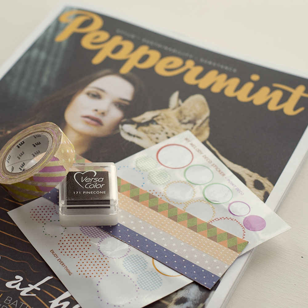
I saw a tweet by Jess of View Point Handmade Gallery about some stickers she had in store...that basically lured me in & got me thinking. Her store fits what I had in mind for the project...indie, local & I wanted to try using pretty things that weren't from a typical craft/scrapbook store. I grabbed a roll of washi tape, a handful of stickers (translucent, fabric, some phrases, patterened paper strips etc.)
Click for larger version
I also picked up a Peppermint magazine that I'd been wanting to read, but also knowing that I would rip some pages out and cut them down to size to use in place of the traditional cards. Unbeknownst to me, there was an article in there about Sibella Court...who is a crazy talented stylist & collector of beautiful vintage finds...so as it turned out I had lots of pages to choose from :)
Click for larger version
From my own supplies, I added some black and white paint, and some letter stickers I hadn't used in ages for the title. I added a lot of writing using strips of white paper with typewriter text on them. This is by far my favourite way to include journalling. I ink the edges as I go...and they get a bit bent and smudgey from me handling them too much before the ink dries...but I think it adds to the look. You can stick them any which way, straight or randomly lined up...you can't go wrong. I use the Travelling Typewriter font which has different weighted letters and is a bit uneven...love.
Click for larger version. Some details are blurred as they are not mine to share online :)
I tried not to care that my handwriting wasn't perfect...to include big moments and random small stuff..and to not over-describe everything (which is hard for me, I love adding text!). Actually now that I think of it, I might have been channeling a bit of Elsie Larson from this post :)
Click for larger version. Some details are blurred as they are not mine to share online :)
In the end, I enjoyed trying something different. I missed using Photoshop to design overlays and my own journal cards so no doubt I will go back to something much more hybrid next month. I have a habit of going all out in a style or look that I love, and then going completely the opposite on the next project. So I'm sure it wont be long before I'm using some 'Midnight Edition' or a lot of white space with pops of neon or something :) But this approach was fun...I liked the raw recycled feel of it...and most of all I love that it supports the idea that Project Life can be whatever you want it to be...go crazy :)
You'll find Jess and View Point Handmade Gallery at 13 View Point Bendigo
Project Life plastic pockets and the co-ordinating official cards are at Meany Potato, 133 High Street Bendigo
Project Life and all online sources (including those for other countries) is here.
You Might Also Like: Project Life March and Project Life February